Tag Archives: Opinion & Humour

What the Bell?

I was rather interested to see a post on LinkedIn recently about “The Myth of the Bell Curve” which was saying (relatively) recent research had shown that human performance is more like a Power law distribution, than a Normal distribution.

The consequences of this is that a cherished HR sacred cows needs slaughtering.  Anyway you can read the post yourself, however, what tickled my interest is what would the two distributions look like when laid next to each other.

There is an image in the publicity material that attempts to show this…

image

…but that must be mathematically wrong, surely!

Nurse, bring the oxygen!

Both the Normal Distribution and Power Law are both types of probability density functions. however, as far as I can see from the published links, they have different axes:

  • Normal Distribution:  X = performance metric, Y = probability of that performance metric
  • Power Law :  X = some indicator of population; Y = performance metric of some sort

The problem of comparing these two is is that you need to rework the data to get both on the same axes.  Making the hypothesis that the x-axis of the Power Law is the performance rank of an individual – like a Zipf curve equivalent.

So X is not the size of the population, ‘cos that is just absurd:  the curve would otherwise show that for that any population of 1 is really brilliant, whereas the bigger it gets the more stupid it is…mmmm, weelllll, depends on who is counting themselves as the One, and how many of the rest read the Daily Mail/Mirror/Express/Sun/Star…

So if you work the data on that basis (modelling an arbitrary population size of 100 people) then the curves actually look like this…

Power law

…so they are curves with quite different shapes.  And if you re-plot them the other way round, then they look like this…

Normal

…which might superficially look like the picture at the top, but is actually showing the population of the long tail as the tall spike, not top performers.

Still a rather scary picture, as it indeed suggests that most of the people in the “team” are rather serious under-performers, hanging on the coat-tails of the many fewer high-flyers!

This may be a figment of the example data somewhat, and taking a probably unsubstantiated analytical leap, we can readjust the power law chart to align the median figures of performance and come up with a chart like this…

Normal (power adjusted)

…which even still suggests that there are a load of sub-middle slackers sitting on their hands, and they should really get moving and DO SOMETHING!

My general theory that if when leaving the house on the way to work in the morning, you harbour the thought that “today, “I will not make a difference”, go back indoors and get back under the duvet.

So I have scratched my itch, not sure it was so much fun for you, so here is another useful framework to help guide thinking and action and considers the destination of projects…

Thinking is…

..rigorous

A wasted opportunity swirling round the Plug-Hole of Life

Nirvana

..waffly

Hell,
by way of a path of good intentions

Nuremburg

..waffly

..rigorous

Implementation is…

Unbalanced reporting, or just unbalanced?

Jonathan Swift was on to something when he picked out in Gulliver’s Travels the pointless and apparently irreconcilable Big-Endian / Little-Endian debate on the island of Lilliput (a metaphor for religious schism in 16th and 17th century England, as it happens).

The question “Are you a Morning Lark or Night Owl?” is another of those that has its merry bi-band of quarrelsome, bifurcated and dichotomous disputants, bickering and unable to arrive at any accommodation, mutual agreement or consensus view.

So the recent study by Dr.  PK Jonason was, of course, like oxygen to those people who live to stir things up a bit, leading to headlines such as

Night owls have more ‘evil’ personality traits: study (Business Standard)

That’s not what the study actually says, as it just focuses on three personality characteristics (The Dark Triad) and their distribution amongst Chronotypes and so does not equally point to any irksome, venal, or other unpleasantness of the early risers.    However when did balance ever come into the equation in getting a headline?

Well in chemistry actually, where you definitely have to balance your equations…

Didn’t Mark Twain say “Never let the facts get in the way of a good story”.

Did he or didn’t he, I don’t know, does it really matter, is it something people have a fight over, well let them!

And he was a story teller, not a scientist…

So the study may have been a bit narrow in scope, but still science (assuming the peer reviewers also agreed about this), and sadly abused by a rather unbalanced headline.

In the Larks/Owls debate, of course, you find it is of course that things are more complex than the simple binary,

There are some key consulting frameworks that are designed to help people solve more complex problems than just by pure binary thinking

The Boston Grid is a good example that expands thinking to at least two (binary, smoothed, averaged) dimensions and has four outcomes (or more if you start sub-dividing the individual boxes, but that gets hard to read, and clarity of thinking is, of course, the whole point, not “clever” smart aleck chart drawing).

Note in particular the national difference that shows that, in the analysis, Spaniards are more Owl-ish than the Larky Italians (well, relatively), and Machiavelli was Italian, so put that in your pipe and smoke it…Gift with a bow

Binary decision constructs are generally (*see footnote) grossly over-simplified and massively averaged “big picture” way of thinking about stuff, and most situations are actually formed from a spectrum of factors, which the human mind reduces ad absurdum to “are ye wi’me or agin me”.

Someone once said that I “hoover up complexity” which was, I think, a compliment overall, on balance, and in the general scheme of things, but also a cogent warning to avoid rocket-scientist gibberish, too!

Even a well-meaning spectrum view can still present a one sided and possibly biased picture, and the balancing aspects need to be added.

The Autism spectrum is an example of what can be considered as a one-sided spectrum, since “Normal” sits at one end, not in the middle like a properly balanced continuum.

I rather liked this view Psychosis and Autism as Diametrical Disorders of the Social Brain: converging evidence!! that describes a wider spectrum from Schizophrenia through “Normal” to Autism.

The real story is probably nearer to a 2D surface, or in fact many more dimensions, but that does start to hurt a little bit.

And so, maybe a enigmatic spider-web diagram to finish…

Spider web chart


*Footnote

Ok, so putting “generally” against any assertion is one of those averaging and simplifying devices used to smooth over the roughness of real-life situations.  But what the heck, this is rhetoric, and I stand my ground, Sir!

Technology and the Zone of Uselessness

They let me out for a short trip to the shops today, and whilst I was waiting to pay, I watched an old geezer struggling to put his chip'n'pin card in the right way round.  Which set me off thinking about what happens when you get old, and at what point does the pace of technology evolution overtake and you are left in the dust, a crumbly, fumbling, useless old curmudgeon, no longer able to function properly nor interact sensibly with the environment.

To further the analysis we can consider this table of the evolution of user interfaces (keeping a fairly tight scope to cover mainly electronic means)…

Primary Mode
of Interaction
Examples Era of invention
Tap Telegraph key (button) Late Georgian
Shout Candlestick phone Victorian
Rotate Rotary phone, Wireless with Bakelite knobs, steering wheel (drive by wire) Victorian
Bash / Prod  QWERTY keyboard, keypad Victorian
Look Eye tracking Early Miss-Marple
Wiggle Joystick Wilson-WhiteHeatian for electrical (although Early Edwardian/La Belle Époque (for mechanical)
Blow Typing aids,
Blow controlled mobile phone, ignoring the Captains speaking tube…
Flower-Power
Waggle Mouse Engelbarto-Xerox PARCian
Scribble GridPad, Apple Newton, Palm, Ipaq, Tablet PC Yuppie-time
Fondle & Stroke Smart phone, tablet SonyEricssonian-Jobsian
Wave Nintendo Wii, Xbox Kinect, data glove TomCruisian
Shout 2 Speech Recognition Rock and Roll, but it hasn't really happened yet properly, maybe JeremyClarksonian, when it does (JC is famously unable to use any voice operated equipment)
Think emotiv EPOC neuroheadset Yuppie-time

…and whilst you can see that a lot of stuff was actually invented a long time ago, having been around for over 100 years in some form, there has been quite a rush of invention in more recent years, hanging on the cot-tails of the primary evolution of computing technology, no surprise there, I suppose.

One of the more interesting insights, for me as an analyst and connoisseur of number crunching, is that whilst many of the newer inventions have been for various methods of computer control,  there is a paucity of newly invented data entry methods, beyond the humble and ancient keyboard.  

With the dominant design of the QWERTY keyboard to the fore, there have been really no successful disruptive plays, and most inventions have focussed on just reworking the layout (e.g., DVORAK, frogpad, FITALY and their kin).  Chord keyboards made a bid, but, of course, like any shorthand method you need to learn a new language, and they never took off.

The FITALY keyboard is a nice design that fits well with modern joy-pad units like xBox and smartphone touch interfaces, as it minimise the amount of clicks, or finger movement movement to type a letter so is quite fast , however at $49 for a tablet computer it is never going to amount to much

Extending the idea of chord keyboards and use of non-verbal language, there is undoubtedly some scope for non-keyboard data-entry devices using gesture control  to recognise sign language (and that hopefully avoid Gorilla-arm that afflicted early days vertical touch screen users).   Although, the new “language” learning problem still exists, and Babel will always be an issue, unless we all adopt Ameslan or Microsoftlan, or AppleJobsLan.

Now I believe that I can rightly consider myself  pretty well up on the world of technology and there is very little that fazes me.

In fact, many pieces of broken equipment will just fix them in my presence, or so it seems, when my family call the DadHelpdesk, and I just lean over languidly and in my calming presence, and the recalcitrant kit just bursts in to life (maybe with a judicious key press or two)

But don't ask me about *&^$*^%ing plumbing – compression joints, meh!

So I do think that my threshold of uselessness is likely to be pretty high (or do I mean low), and consoling me today, my elder son told me that “people don't get dumb, they just get old” (i.e, if they were stupid to start with, they will be stupid, old people), so maybe there will be some hope…

However, like VCRs, which kids can programme with ease whilst their parents just fumble, the evolution  of new technologies and UIs in particular, is much influenced by the volume of fluent, capable users, which itself flows with the generations.

To this, one area of technology that I do not really bother with is computer games beyond a half-finished PC version of Dune in 1992, I'm just not interested in playing them (I can feel my life slipping away).  Therefore I am not particularly adroit when it comes to using a joypad, and have not built up great dexterity and flexibility in my hands and fingers (unlike most teenage boys) for that type of device.  The one time I played Castle Wolfenstein, I spent the whole game bumping into walls whilst staring at the floor or sky!  And Second Life, oh so bad!

More so, I  have never been able to make the three-fingered boy scout sign – I never was a boy scout, also just not interested – my hands just don't bend that way.

And finally, I have a very highly tuned embarrassment inhibitor which tries to stop me doing things that would cause a red face (it doesn't always work, even with my personaility type…)

So what is my old-age technology nightmare scenario?

  • having to visit Castle Wolfenstein to get my pension…
  • …electronically bruised after a long, slow, meandering (virtual) walk from the entrance of the Cyberspace Business Park…
  • …inputting my data by waving my arms wildly whilst holding my walking stick trying not to fall over…
  • …and making complex mudra with my crippled and twisted old hands.

Ye gods!  Build me a Bluetooth neural uplink, and make it snappy!

Elephants…

Spring is busting out all over up here in Lincolnshire, spurred on by the lovely weather recently.  The swallows are back in the barn, always good to see that they made it back from South Africa (where the RSPB tells me British swallows over-winter).  The trees and flowers are all blooming, not quite yet into the Bluebell season yet, but plenty of colour… Lincolnshire Spring 2011

Whilst enjoying the sunshine and in the full flush of the other joys of Spring, one of the topics on my mind recently recently has been Service Integration, an important ingredient for delivering excellent IT services.  The nub of the issue that Service Integration looks to solve is like this:

In recent years, the trend for contracting IT Services has been to push beyond the big-bang mega-deals of old to selective outsourcing of like groups of IT services , dubbed “towers” by industry pundits such as Gartner and their ilk, thus:


IT Service Towers

I won’t bore you with the detail here as to why this model doesn’t work that well

However, user services are often a combination of pieces from each tower, so to make users happy, avoid incident “ping-pong” and other good things, services really need to be managed in a joined-up way, orthogonally to the towers, like this

End to end service model

This glues, or integrates, if you like, the different elements of a complete service, hence, this joining-up is “Service Integration”

You could abbreviate Service Integration to SI, but this is ripe for confusion with the older usage of SI, as Systems Integration, all about gluing together bits of software and hardware to make new systems, i.e., Building systems rather Running services.

There have been a number of landmark deals espousing the Service Integration model , from ABN/AMRO and the “Guardian” model back on 2005, through to the most recent state if the art at National Grid with the recently penned deal with HP ( Computing article on National Grid / HP SMI deal and HP Press Release).

One of the usual suspects in building such a model, is dear old ITIL, now ISO/IEC20000

Not to be confused with Tyltyl and Mytyl, characters from Maeterlink’s Blue Bird, a well-known childrens’ classic

ITIL is a worthy model  and has been around for many years since penned by the CCTA, and is now at version 3,. Version 3 is quite good, as it has finally acknowledged that services have a life-cycle, and gosh, this sort of stuff is iterative (what a buzz).  V1 and V2 in contrast had rather static views of the world)

I was astonished recently in one of those rare, but memorable, jaw-dropping, goggle-eyed moments when a sales guy from some other organisation opined in a meeting (to paraphrase) “Why all this fuss about V3, there’s some really good stuff in V2”.  Everybody in the room looked  at the poor unfortunate in deadly silence as he swallowed his foot and half his leg up to the knee and lower thigh, and from that moment he became nobody, a nebbish, a zero.  Ouch!

Nebbish – a Yiddish word meaning “an insignificant, pitiful person; a nonentity”, very effectively characterised in a book I once read but can no longer recall the title so cannot name-check or credit the author (sorry), as a person who when they walk into a room is like someone just walked out

ITIL V3 was published in 2007, but only just really made it into the 21st century with its iterative, nay, agile, flavouring, yet there are a number of “elephants in the room”, major topics not covered that are essential components in the full business architecture of modern IT service delivery…

Elephants in the room

Not just a few elephants, but a thundering herd in fact, in the form of (not exhaustively):

  • Innovation
  • Managing Technology investments
  • Multi-vendor service integration
  • Deal Structure  and Partnership Management
  • Pricing, Billing & Charging
  • People, Culture & Structure (at least 3 elephants, in just this line alone.)

COBIT makes a much broader sweep in its attempt to embrace the whole entity that is a living, breathing IT organisation and seems to fill many of the gaps not covered by ITIL.

Yes, I know I bang on about Innovation quite a bit in these posts, but it is a common current complaint I hear that innovation has been squeezed out  in deals struck in the 2000s, and now the demand is to find ways to enable it again, even to the extent of considering to pay an Innovation “premium”.

COBIT, founded in GRC, and providing an excellent check-list with which to herd most of the elephants, is as blind as ITIL when it comes to Innovation.  If you search through the text of the COBIT 4.1 framework definition doc, you will find the word “innovation” writ not once at all in its 197 pages!

GRC = Governance, Risk Management & Compliance, in case you wanted to know

Risk management is as central to innovation and agility as it is to the philosophy of COBIT with its focus on control.  Yet there is a classic schism between the COBIT GRC-based shibboleths and the ways of innovation and agility, and one might cynically draw the conclusion that COBIT is about stopping things getting done, whereas innovation and agility are the polar opposite – “skunkworks” innovation is the antithesis of the GRC mindset, even anathema.   And, of course, COBIT is process-oriented, just like ITIL.  Good, but rather 1990s Hammer & Champy and still further to go to get into the 21st century.

The COBIT 4.1 Executive Summary contains a hugely contentious and flawed.headline on page 13 vide “PROCESSES NEED CONTROLS”. To justify this you need to follow this syllogism:

  • Processes are risks
  • Risk need controls
  • Therefore, Processes need controls
    (yes, this is, indeed, nonsense)

This does not compute, the base premise is wrong: Yes, High risks, whether processes or otherwise do need controls, but don’t waste time putting controls on low risk processes.

“Quick, evacuate the building, we’ve had a slightly embarrassing failure to detect a root cause in Problem Management”

Also, processes can be controls, so do we add meta-control processes to control the control processes? – Quis custodiet ipsos custodes ad nauseam.

You may think that I am  being rather harsh on the solid works of people who have created ITIL, COBIT et al.  These frameworks are all useful check-lists of best practice, but need to be used with some care, lest the medicine kill the patient.  And they help with the standardisation of service descriptions when making like-for-like comparison somewhat easier in the sourcing and procurement process.  However, they are inevitably behind the leading edge. for example, getting joined-up in the customer experience dimension (orthogonal to both towers and process orientation) is yet another step to go.

On the other hand, getting up the curve to build Innovation into modern IT service deals, well, that can be done right now (give me a call!)

Aristotle and all that

I have been away from my desk quite a lot recently cavorting around the motorways of England, racking up the miles on my poor hard-worked steed, but now I have a few minutes to sit down and pass on an interesting observation….

Just a momentary tangent before we head into the main meat, so to speak, there is another blog post that I have been meaning to write about Broadband Britain, Cloud Computing, the Innovators Dilemma, passing by the new statistic that the number of of old people in the UK now exceeds the number of young, and arriving finally at some as yet unthought pithy comment about Silver <read, Grey> Surfers. However, it is really just an excuse to create a comic juxtaposition alluding to the alleged practice of North American ethnic peoples (no longer Eskimo) to abandon their old folk on ice floes, whereas I have observed over the long miles I have travelled in the last few months that we British seem to abandon them at Cherwell Valley Services on the M40…so lets move on

Anyway, my recent revelation is related to this framework below plucked from the world of transformation consulting and change management as relayed to me some years ago by one of my erstwhile consulting chums.  The blobs relate to managing communication with people during significant changes on three dimensions: Rational, Political and Emotional.

rpe balls (web)

The ‘sweet spot’ is in the centre when all communications are most compelling as they appeal to all these three.

Coincidentally, whilst  trying to be a useful parent and reviewing a Classics essay, I prodded Google about some topic to draw back the veil of my ignorance on such topics and it popped up with Aristotle’s three modes of persuasion

  • ήθος – Ethos
  • λόγος – Logos
  • πάθος – Pathos

Thus, in seasonal form…

aristotles baubles (web)

Whilst equating Ethos to the Political dimension somewhat turns my stomach when I think of the more venal and self-aggrandising aspects of the political world, the three blobs of the R…P…E model are a pretty good match for what Aristotle laid down.

So there you go….

Beware of BS Benchmarks & Krap KPIs

Recently our esteemed Green Knight, Sir Jonathan Porritt was attributed with saying  “Overweight people are ‘damaging the planet'”.  Of course it turns out that he said something like this in about 2007, in fact building on a comment by the then Secretary of State for Health, Alan Johnson.  But somebody else unearthed it again for some typically twisted reason – nothing can be more topical than mixing global warming with a bit of “fatty slapping”.

The hypothesis behind the hype is that fat people use more resources because they eat more food, but why not then include teenage boys (unfillable, as empty fridges around the country can testify), people with very high metabolic rate, and other some such big eaters.  Ah, well, the logic goes that fat people also drive everywhere and so contribute more CO2 than thin people who, of course, walk or cycle everywhere.   Well, maybe it applies in towns, but it is certainly not true in the countryside, so drawing a different intersection in the Venn diagram I am sketching out here in hyperspace, maybe the headline should have read “Teenage boys and country people with very high metabolic rates are ‘damaging the planet”” – not quite so catchy, or right-on, eh?

But, of course, there is a secondary thesis which is that obese people can be “cured”, especially if they all got out of their cars, walked and cycled, and stopped scarfing all the pies, whence their weight would magically drop away and they would join all the normal people in the happy mean.

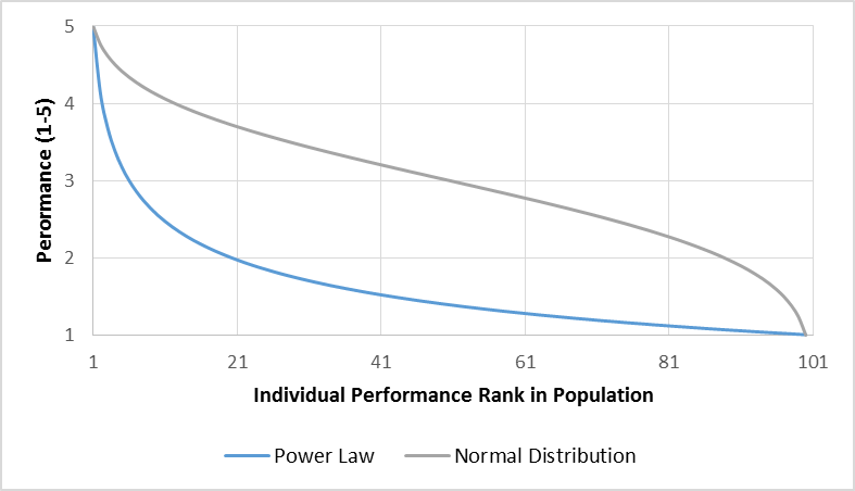
When you look at whole populations analytically then of course you usually see some sort of distribution (Normal or otherwise) of whatever factor (weight, in this case) that you might be measuring.   So the theory is that by thinning down the fatties, the shape of the distribution will be changed. However, there are flies in this particular ointment, and if you look around you can find suggestions that obesity is actually a structural feature of a/the/any human population, that everybody has got fatter and that you need to treat the population as a whole, not just focus on the upper tail.

All in all, an example of woolly loose thinking gussying up to a political agenda.

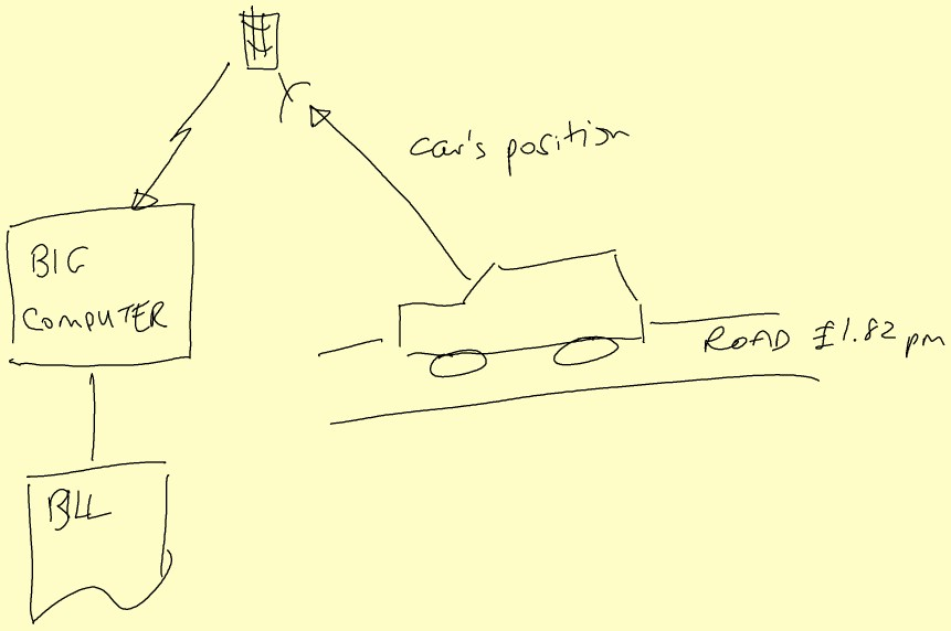
BMI  is one of the weapons in the “fatty slapping” armoury, a metric with some very well documented short-comings, yet standard (mis-)guidance would label people like Lawrence Dilaglio, Jonah Lomu & Mel Gibson as over-weight or obese.  Whilst BMI might have some trivial diagnostic uses, some lard-brained, fat-heads try to use it as a decision-making metric, vide ‘Too fat’ to donate bone marrow – the 18-stone 5’10” sports teacher with a technical BMI of 36.1 who was ejected from the National Bone Marrow Register.  To make a proper health assessment, you need to have a more detailed look at structural features, like waist size, percentage of body fat and so on, before pronouncing.

Just pausing a moment to dissect BMI further, it has units of kg/m2 which is not unlike the metric used to define paper thickness.

Many organisations these days used 80gsm printer paper which is more environmentally friendly than the more sumptuous 100 paper of oldAnd even less rich feeling than the 120gsm paper that Tier 1 consultants use to create a table-thumping report – the dollars are in the loudness of the thump.

As Marshall McLuhan told us, the medium is indeed the message, thickness = quality, and just feel that silky china clay high white finish. Oooohhh…

Sorry, started to get rather indented there, must coach self, control tangents…

So a person who has a BMI of, say, yeah, like 25, is like a piece of 25000gsm paper, no really…equally a piece of A4 paper might have a BMI of about 0.08…

BMI_Badness

Thus BMI is a prime example of a benchmark ratio or KPI that is NOT a good basis for making decisions, as it fails to take account of significant structural factors.

This parable provides an important lesson for practitioners in the world of Information Technology Economics, where many a ratio is measured and analysed by pundits including Gartner et al, a classic being “IT Costs as percentage of Revenue”, one of their IT Key Metrics.

It is defined quite simply as:

ITRMetric

If you dig into the typical drivers of the top and bottom parts of this formula as below, say,

MicroEconomic Drivers – Typical Examples
IT Costs Revenue
  • Business configuration, e.g., Channel/Distribution infrastructure
  • Organisation structure (e.g., headcount)
  • IT Governance & Policies (e.g., Group standardisation)
  • IS architecture and legacy (complexity)
  • IT Service definitions and service levels
  • Development methods & productivity
  • Sourcing/procurement strategy & execution
  • Supplier market diversity
  • Market Structure
  • Competitive environment
  • Market share
  • Product design
  • Consumer behaviour
  • Sales & Marketing performance
  • Customer Service (retention)

then you might surmise that it is quite possible that the Revenue numerator has significant elements that are certainly outside the direct control of the IT organisation, and indeed outside the control of the company, whereas the IT Costs are defined largely by the structure of the organisation, its distribution channels, and internal policies and practices.  The top line is also, I conjecture, more volatile than the denominator, and being mostly outside the control of the IT so a very unfair stick to beat the IT donkey with.  So in qualitative logical terms this metric is certainly appears to be a very poor ‘apples and oranges’ comparator.

If you stretch the analysis further, you can ask the question “what does it mean?”  Is the ratio intended to show the importance of IT? or IT leverage/gearing (bang for the buck)?

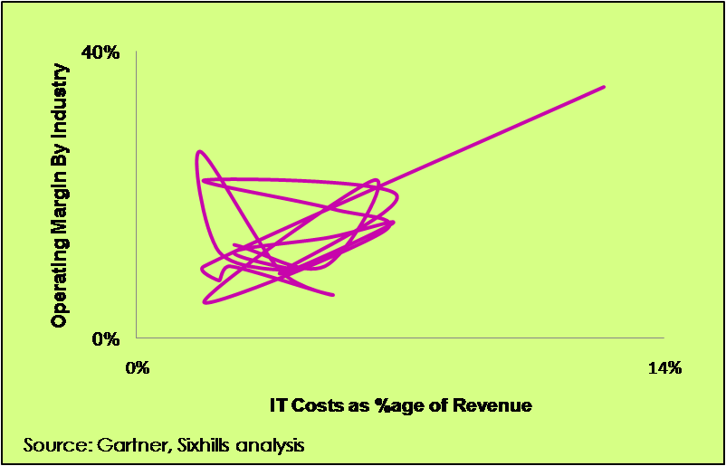
Well, if it is some level of importance we are trying to assess, then we should analyse the relationship between this benchmark ratio and true measures of business value, such as, Operating Margin.  Looking across a range of industries the curve looks like this:

Correlation...

OK, is is a deliberately silly chart, just to make the point that this is clearly a wobbly relationship.
If you do a linear regression analysis of the relationship between Operating Margin% and the IT Cost/Revenue ratio and a sibling ratio “IT Cost as a %age of Total Operating Costs” (or “Systems Intensity” to its friends), then you get these results for R2

R2

IT Costs as %age of Revenue vs Operating Margin%

0.175

IT Costs as %age of Op. Costs vs Operating Margin%

0.330

What this shows is that there is no particularly significant linear relationship between these two key metrics and Operating Margin, so quantitatively, the ratios do not really tell you anything about how IT costs/investment drive overall business performance at all.

Even within an industry ratio comparisons are fairly meaningless.  For example, in the past UK Banks had an average Systems Intensity around 20%.  If you were to calculate the Systems Intensity for Egg, the Internet bank, at its height, you would come out with a number ranging from about 17% to 25% depending on how you treat the IT cost component of outsourced product processing and some other structural factors.  And I do recall having a conversation with one Investment Bank CIO who declared, “Yes, of course, we do spend 20% of our operating costs on IT, it’s how we set the budget!”

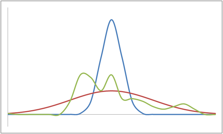
The whole averaging process loses information too.  Look at the four distributions below, they all have the same mean (i.e., average) but are wildly different in shape.

Distributions_with_same_mean

Without further detail on their parameters than just the mean value of the curves,  you cannot make a sensible comparison at all.

So all these ratios give is some rather weak macro illumination of the differing levels of IT spending between industries, like saying to a Bank “Did you know that, on average, Banks spend 7.3 times more on IT than Energy companies” to which the appropriate response is “YEAH, SO WHAT?”…

…Oh, and maybe, some vague diagnostic indication that there may (or may not) be something worth looking at with a more detailed structural review.  So, why not just go straight there, and dig out the real gold!

And so the morals of this story, O, Best Beloved,  are that just because you can divide two numbers, it doesn’t mean that you should, and be prepared to dig into the detail to truly understand how cost and performance could be improved.

Just so.

Just Words

So it has been a torrid couple of weeks for MPs outed having been caught with their hands in the cookie jar.   Schadenfreude, Epicaricacy, aighear millteach and their ilk are good words to roll around the tongue, and savour whilst we lob cabbages and rotten tomatoes at those in the pillory: all the more unattractive being that their “misfortune” was brought about by their own actions and a display of lower moral standards than  is clearly desirable in our political representatives.

Auto-Epicaricacy: a term I just made up, applying some word logic, would mean taking pleasure in your own misfortune. Definitely an unhealthy and paradoxical mental state, but I suppose optimistic, in that every cloud has a silver lining…

I was particularly fascinated and driven to ask “how does that work, then?”  by the declaration of one misadventurer that “Of course I feel that my reputation is tarnished, but my integrity is intact”.

Integrity: the unimpaired state of anything : uprightness : honesty : purity – Chambers 20C 

What logic system do you have to apply, what set of axioms must one have, how must one deconstruct common sense to be able to make this statement?  For a start, you would have to look at redefining some core words: unimpaired, anything, upright, honest, pure – take your pick.

Words are a key part of a consultant’s stock-in-trade, and pictures too.   One of my favourites satirical sites, now sadly defunct, was SatireWire which ran a series of bizarre and entertaining statistical charts like this…

Madrigals By Freshness
madrigals
… a hearty lampoon of opaque and confusing “Management by Cartoon” Powerpoint presentations (one step up, though, from “Management by In-flight Magazine” which is significantly more dangerous).

And of course every industry has its buzz-words and jargon, which can be useful short-hand for many forms of communication, but often quite poisonous when they leak into other places.

Note the use of the word “key” in the preceding paragraph – a consultant-y sort of word if ever there was one, it means important, significant, stands out from the crowd.  Non-key things are not interesting…now go back and carry on reading here

The recent attempt by the Local Government Association to proscribe some logofluvial jargon-words was a valiant attempt to stop etymological pollution in Local Government communication with the rest of us.  I am certainly a fan of Plain English, and keeping things short and sweet with some sharp Anglo-Saxon monosyllables replacing  loquacious logorrheic verbal peregrinations, but equally a devotee of precision and conciseness which some longer words can bring to a sentence, by conceptual elision, perhaps.

So I was interested to see some words on the list that I have used myself and as have many of my colleagues.  These are words from the consulting domain that do have proper surgically precise and correct meanings in the right hands, but indeed deadly in the wrong.  Other words on the list would be posionous in any context:

  • Baseline” is a word I know well that has meaning both in project planning and also in procurement – in both areas being the datum from which you measure some sort of progress or achievement.
  • Predictors of Beaconicity“, however,  is never going to win any prizes for clarity….

The list is also very good material for Buzz-word Bingo…

And talking of words and in an interesting juxtaposition of neurons firing, I noticed that the BBC were having a Poetry Season.  Being a self-professed iconoclast and fact-based sort of person, I have a completely tin-ear for poetry which is just a form of “talking funny” (in an unfunny way, unlike puns).

So to finish, I have constructed a Boston grid attempting to make some sense and classify some of the odder behaviours of my fellow human, viz….

“Talking Funny”
  • Poets
  • Committee meetings
  • Consultants (some)
  • Morris Dancers
  • Mickey Mouse
  • Street Mimes
  • Opera Singers
  • Michael Jackson
  • Klingons
Normal
  • Most people
  • Cycle couriers
  • Bee-keepers
  • Sports-people (most)
  • Customer service agents in uniform
  • Builders
Normal “Dressing Funny”

Phosphenes & Palimpsests…

About a year ago, I went though one of those few moments when I thought my normal powers of memory had somehow deserted me. It was not really anything important I couldn’t remember, just the word that describes the the lights you see when you squeeze your eyes tight shut. Like this…
Phosphene_artistic_depiction
So not very significant in the scheme of things: not one of the words I actually use very often in conversation or in Powerpoint presentations. Just annoying, because the word was just lurking on the edge of my perception, out of reach. But something that you can get a bit obsessed about when information normally falls to hand or mind quickly…

So I Googled and Wiki’d and all those searching jobs that normally count as work, and kept finding Tom, Nicole and Stanley and their film, and other flotsam and jetsam on the endless waves of Web surf.

But, eventually, I created a mega-whiz, sharp-as-a-scalpel, spot-on search string that gave me that Eureka moment…Ding!

The word I was looking for was “Phosphene

Mind you the Eureka moment was over quickly, as I came to that odd feeling that I had never known the word at all so how could I have semi-forgotten or demi-remembered it? But let us not confuse the story with such technical plot twists and devices.

Palimpsest is another word a bit like Phosphene, but in reverse, I know what the letters say, but the meaning slips my mind (a reused bit of parchment, in fact). It is however a word that I have read many times but never ever had the need to write down – until today. It is definitely a clever Stephen Fry sort of a word, or maybe a Will Self word

I wrote “normal powers of memory” at the top of this piece, though we Jungian Is “enjoy” the physical aspects of memory that are imposed by our brain chemitstry, being the dominant long acetylcholine pathway, compared the the short dopamine pathway of Es out there.

If you looked inside my head, it might look something like this…
Phosphene_artistic_depiction
…but brighter and probably in colour.

So I worked out many years ago that I should not waste my time remembering stuff, when a notebook works much better.

And so on into the Wonderful World of the Web, I have always found it useful to clip bits out and paste them into my digital scrapbook for longevity and to act as my long-term cyber memory. I gave up on browser Favourites early, as they quickly became useless signposts to where information was no more.

In my Adobe period, I printed bits of the Web to PDF files and stored them in a byzantine filing structure. But, eventually I settled on Onfolio and paid some brass for a real product…and then Microsoft bought it and gave me back my money because they were giving it away free in the Windows Live toolbar…then to become a zombie, twilighting product. The death knell was when they switched off the licensing servers last September.

RIP, Onfolio, you served me well

So I had to indulge in one of those distress-driven searches to find a new digital brain. I tried Ultra-Recall which can import Onfolio collections, but has the user experience of a broken lift. I tried TopicScape but that felt like I was in Castle Wolfenstein or Jurassic Park (the ” ‘I know this, it’s UNIX’ whilst looking at a mad graphical computerscape ” moment), and a host of other paraphernalia and arcana.

So I have ended up with MacroPool’s Web Research, which feels a bit like Onfolio…but German…so hopefully it will be most efficient. We’ll see…

Crunchy Octopus, with Pesto Sauce

Life, media-style, is normally quiet in the nether regions of Lincolnshire, but having had an earthquake last year, it seems that the papers are thirsting for more excitements from the Wolds.  So we have started the year with an exciting story “Tentacled Alien Destroys Wind Farm Generator”, pictured below just after the accident (a genuine photo, for sure)…

Broken_Windmill

I have commented before about the impact of global warming, but I think having an ocean-going octopus visiting now is rather premature, and in fact any, extra-terrestrial cephalopods foolish enough to embrace a windmill is going to end up as sushi.

Of course, the alien story is a good way of diverting attention from the otherwise suffocating Credit Crunch

I was going to write something clever about “interesting times” here but when looking up the origin of the phrase it turns out that the alleged curse has very little provenance – the quixotic and capricious Wikipedia suggest it might be related to the proverb “It’s better to be a dog in a peaceful time than be a man in a chaotic period” (寧 為太平犬,不做亂 世人; pinyin: níng wéi tàipíng quǎn, bù zuò luànshì rén).

Bubbles are always predictable with 20:20 hindsight, and make a nonsense of some of the great prognostications and punditry, when all comes crashing to the ground.  Arthur C. Clarke summed up the dangers of prophecy as Failure of Imagination, and Failure of Nerve.  To which we could probably add Failure of Intelligence to make an unholy trinity.  Intelligence comes in many forms of thinking process as well as keeping a good look-out.  Previous major failures of forecasting include the dot.com bust, of the prior forecasts for commercial trends were spectacularly off:

B2BLX

… and which also makes me think that, in the terms of control systems theory, that the whole global commercial and financial system is large and complex enough not to observable, let alone controllable (although the jury is out as to whether it is quantum indeterminate).

Which brings me to one of the classic, but flawed frameworks that are often used in the crystal-ball gazing process: the PEST analysis which attempts to scan important trends in Political, Economic, Socio-Cultural and Technological  domains.  Variants posited include:

  • PESTLE/PESTEL – Political, Economic, Sociological, Technological, Legal, Environmental;

  • PESTLIED – Political, Economic, Social, Technological, Legal, International, Environmental, Demographic;

  • STEEPLE – Sociodemographic, Technological, Economic, Environmental, Political, Legal, Ethical;

  • SLEPT- Social, Legal, Economic, Political, Technological

  • FARM: Feudal, Agricultural, Religious, Magical (for medieval lords, thanes and serfs, etc..)

OK I made the last one up, but it demonstrates that PEST is a rather basic cookie-cutter analytical tool, and certainly not MECE  in its scope.  Inevitably, the framework you use for forecasting is influenced by the current frame of reference and warps the lens with which you look at and filter the trends.

In the spirit of improvement, albeit strapping wings to a pig, I can offer my own variant: PESTO.  The “O” stands for “Oh sh*t”, that category of all other things that we didn’t think about in the other four categories, or plain just aren’t under the microscope, or even do not yet exist, be imagined or people don’t think can happen, and so on.

The Red Queen trumps Karl Marx – change is constant and things always move on, become different. Change is, not dialectical, sorry Karl, you backed the wrong horse.

The solutions to long term forecasting problems, is to think/work in short cycles, and react/respond quickly to keep up with the changes, and adapt to events as they arise.  Be Agile!

Sunsets

Postscript: I cannot finish without acknowledging the death of my Uncle Edward in December, the last Gueritz of his generation, and remarkable with it. You can read his story here

GPS-enabled Road Pricing. Hah!

I recently had  to to go to Kent at short notice, and since I was heading into relatively unknown territory on a long journey, I zero’d my satnav trip details, a rare event.

When I got home, I flipped to the trip detail screen and was tickled to see this trip record shown below…

was_it_a_veyron (works)

The distance looks right,  but behold,  my Max Speed was apparently 242 mph – was I driving a Bugatti Veyron (top speed 258 mph)?  – I think not!

This makes you think about how useful is GPS data as the foundation of a national road pricing system  – the answer is probably in chocolate teapot territory!

Many people think that a satellite based road pricing system would work roughly like this…

Road pricing - how people think it works

…with the satellites somehow detecting the position of your car and then transmitting the data to the Big Computer that adds up the price of the  the roads you have been sitting on, and then issuing a bill.

But of course the satellites don’t detect the position of the car at all, it is the Black Box in the car that does all the work, and so a GPS-satellite based road pricing system would really work something like this….

Road_pricing_How_it_might_actually_work

…with the car working out where it thinks it is, and then (somehow, by mobile phone, maybe) sending the data to the Big Computer that…well, you get the picture, don’t you…

If such a system were built, then once people twig the way things work, the little Black Boxes will be wearing tin-foil hats – to block the incoming satellite signal, and then to stop the mobile phone signal going out; result: No road travel data = no payment.

So the Power-That-Be would have design some sort of method of enforcement.  What better way than using the Automatic Number Plate Recognition (ANPR) cameras that are sprouting all over the place.

All you need to do is cross-relate the journey data received from the in-car black boxes with the location of sightings according to the cameras.   The system would look something like this…

Road_pricing_How_it_might_be_enforced

Thinking a bit harder than maybe my satnav did, then you can imagine many points of error:

  • confused satnav systems
  • lost distances travelled in tunnels, city canyons, and inside little tin foil hats
  • black box failures, including maybe “failures” induced by sharp, stabbling screwdrivers
  • failed/partial uploads of trip records
  • misrecognised number plates
  • cars and drivers missing from the database
  • and more…

Aaaaaaaaaagh, a merry feast of error compounding upon error, a veritable panoply of tainted data, a concatenation of absurdity!

Multiplying up the error probabilities in this ordure-filled pipeline, and you will get a success probability in the mid-seventies percent.   Not good…

I have previously mentioned the risk profile of Government IT projects so I won’t bang that particular drum again here, but you can always look here to remind yourself…

My trip would have earned me about 18-points on my licence, a big fine, a 5-year ban, and probably 6 months in chokey for apparently travelling at 182 mph faster than the National Speed limit.

So if/when we end up with a GPS-powered road pricing system, expect the worst!

Footnote:  the charming and naively executed diagrams in this post where brought to you courtesy of a DigiScribble pen.  It calls itself ” The Mobile Digital Note-Taker”, but using it underlined for me the fatal flaw of all write-only devices…you can’t see what it thinks you wrote until you upload – too late, way too late