
On a plane flying back from Boston (Mass.), eaten second breakfast of the day, watched a bit of “Where the Wild Things Are”, annoying, fractious kid who needs therapy (or a sharp slap) and a bunch of needy, fractious rather dopey creatures, disappointed, switched it off, didn’t even care to see if he was reconciled with his poor benighted mother, bored, listening to Muse, need a coffee, some battery life in laptop, here goes…
Recently, I was working with a colleague who exclaimed “You’ve got to be a professor to understand that page” when looking at a consulting 2×2. Indeed there are some great pages in the world that capture some key thoughts or concepts so concisely that they can be expressed just on one page, but need a voice-over to talk through the layers of meaning embedded, maybe like one of those pointillist paintings or a fractal montages that is made up of pictures that are made up of pictures…(but perhaps not a Dali-esque or Picassoid other world view?).
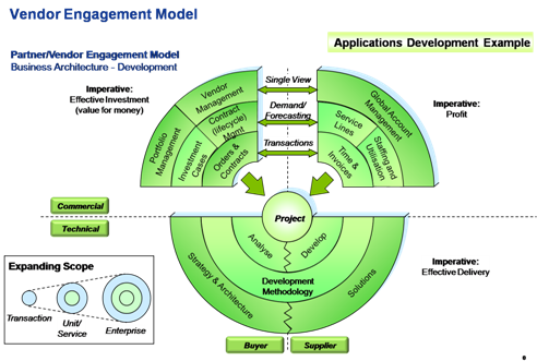
This diagram below (not the one being commented on, I hasten to add), captures the entire eco-system of outsourced application development on both technical & commercial dimensions, ranging from the narrow individual project up to the strategic vendor relationship level
Very clever, of course, but it really deserves to be supported by 20 following pages to unpeel the layers and break out the key concepts, etc., etc.
(oohh, a quick round of orange juice…)
But it looks like this when you morph it Dali-style…
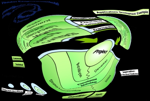
…but that is just plain silly, of course. (but an excuse to try out the Virtual Plastic Surgery Software, why don’t you give it a go on one of your favourite photos, and make your self look like your favourite film star, or the Bride of Wildenstein…)
Battery dying….break to watch X-Men Origins: Wolverine, just another load of shouting and uber-angst
Down on the ground now…
However, there are some charts that are very easy to understand, but they do convey a message that is counter-intuitive, and so take a while to get your head round.
This chart is a good example
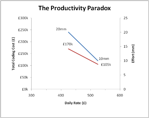
This shows the output of a model of software development productivity which paradoxically shows that total coding cost falls whilst the developer daily rate increases. This is, of course, quite counter to the expectations of typical Aggressive Sourcing gigs which tend to focus on bashing down the daily rates. The Old Wives and proverb writers of yore new about this since the principle of “Pay peanuts and get Monkeys” is well known.
This is what they used to say, but I do wonder if this phrase might be considered racist in these days of off-shoring, say maybe it should now be “Pay Peanuts, get Numpties” or something like that…
The twist in the tail on this analysis is that in the formula P x Q, where P is Daily Rate, and Q is the number of days needed to complete the project, some people (yes, them) are not aware that Q is inversely proportional to P. This is the essence of the move to Agile development methods, which favours people over process (amongst other things).
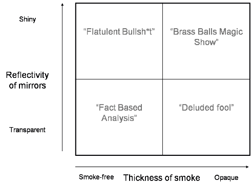
Finally, I also offer you the 2×2 I wrote all by myself one day after an afternoon’s presentation by one of my erstwhile colleagues, a quite (self) important and entitled sort of chap who gave a long presentation from which I came out reeling with “Framework overload”, having survived the discourse from the evolution of Sailing Ships to Dell’s policy build to order policy and positive cash to cash resulting…
So I drew this…
So there you go…